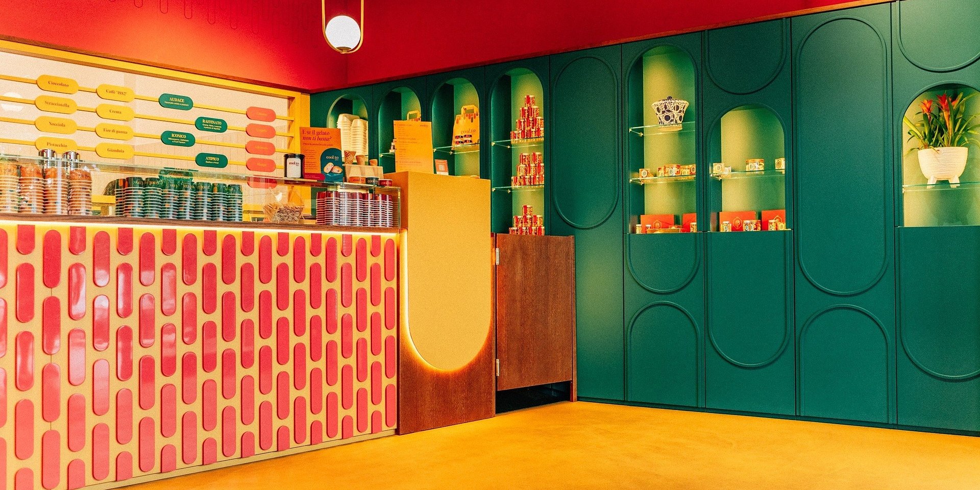
CGF Design, an Italian company specializing in the design and creation of bespoke furnishings, has developed the interior design project for the new Gelateria COOL.TO in Vinovo (TO), transforming a 32 sq m space into an environment that goes beyond the traditional concept of a retail store.
The project, developed by architects Valentina Pelizzetti and Marco Gini, stems from the desire to create a distinctive and memorable place, where every element contributes to shaping the brand identity. The aim is not simply to provide a place for selling gelato, but to offer an immersive experience in which architecture, communication and product interact in a coherent way.
DESIGN E FILOSOFIA
The design philosophy starts from a clear idea: going beyond the simple retail store. The gelateria thus becomes a place to experience, remember and share, a space capable of conveying the personality of the brand even before tasting the gelato. The project creates an experience that engages visitors through colours, materials, light and details, turning every element into an integral part of the story.
The centrepiece of the project is the striking display wall, conceived as a defining architectural element. The shaped frames recall the form of traditional savoiardi biscuits, reinterpreting their profile in a contemporary way. The motif runs across the entire wall, becoming a distinctive graphic feature that enhances product display and defines the character of the whole space. Behind it, a composition of small rounded metal panels introduces a dynamic, modular system: the elements can be easily inserted, removed and repositioned to update the available gelato flavours. A design solution that combines operational flexibility, everyday practicality and aesthetic value.
The project, developed by architects Valentina Pelizzetti and Marco Gini, stems from the desire to create a distinctive and memorable place, where every element contributes to shaping the brand identity. The aim is not simply to provide a place for selling gelato, but to offer an immersive experience in which architecture, communication and product interact in a coherent way.
DESIGN E FILOSOFIA
The design philosophy starts from a clear idea: going beyond the simple retail store. The gelateria thus becomes a place to experience, remember and share, a space capable of conveying the personality of the brand even before tasting the gelato. The project creates an experience that engages visitors through colours, materials, light and details, turning every element into an integral part of the story.
The centrepiece of the project is the striking display wall, conceived as a defining architectural element. The shaped frames recall the form of traditional savoiardi biscuits, reinterpreting their profile in a contemporary way. The motif runs across the entire wall, becoming a distinctive graphic feature that enhances product display and defines the character of the whole space. Behind it, a composition of small rounded metal panels introduces a dynamic, modular system: the elements can be easily inserted, removed and repositioned to update the available gelato flavours. A design solution that combines operational flexibility, everyday practicality and aesthetic value.
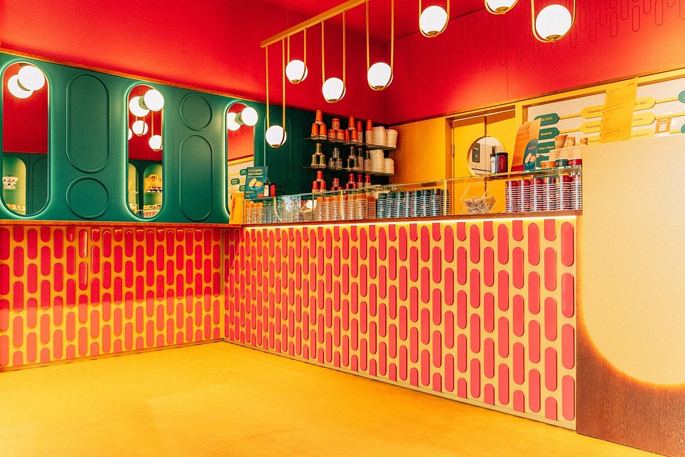
The counter also becomes a key feature of the project. Its cladding echoes the design of the rounded forms, creating visual continuity with the wall and reinforcing the overall design language. The backlit decorative motif adds depth and helps turn the counter into a striking feature that immediately draws the eye.
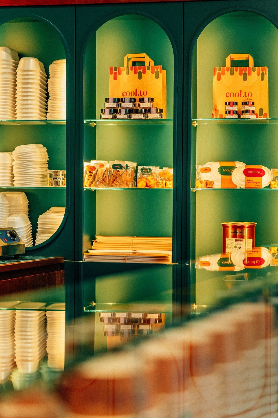
The reflective surfaces, thanks to the shaped mirrors, amplify the perception of space and multiply the interplay of light and colour, while the display niches integrated into the wall panelling turn the wall into both a functional and decorative element, designed to accommodate products, packaging and objects that contribute to the brand story.
The reflective surfaces, thanks to the shaped mirrors, amplify the perception of space and multiply the interplay of light and colour, while the display niches integrated into the wall panelling turn the wall into both a functional and decorative element, designed to accommodate products, packaging and objects that contribute to the brand story.
MATERIALS AND COLOURS
The quality of the execution is evident in the selection of materials, chosen to combine durability, elegance and functionality. The project uses solid oak, extra-clear glass shelves with polished edges, shaped extra-clear mirrors with polished edges, shaped wall panelling made from 19 mm MDF panels with a matt lacquer finish, green Laminam surfaces and bespoke metalwork.
The identity of the space is also defined by an intense, contemporary colour palette that pairs the deep green of the walls with the vivid red of the ceiling and vertical surfaces, complemented by the warm yellow of the floor and the back-counter screens. A bold choice that brings energy to the environment, reinforces its distinctive character and expresses the brand's fresh, young and pop personality.
The matt finishes interact with the transparency of the glass and the brightness of the metal elements, while the wood introduces a note of warmth that balances the vivid colours, creating an inviting environment that is also highly theatrical.
The project confirms the nature of CGF Design, with its ability to create bespoke projects by carefully analysing and crafting every detail. This approach makes it possible to transform commercial spaces into environments with a strong identity, where architecture, interior design and brand communication converge in an experience that remains imprinted in customers' memories.
The quality of the execution is evident in the selection of materials, chosen to combine durability, elegance and functionality. The project uses solid oak, extra-clear glass shelves with polished edges, shaped extra-clear mirrors with polished edges, shaped wall panelling made from 19 mm MDF panels with a matt lacquer finish, green Laminam surfaces and bespoke metalwork.
The identity of the space is also defined by an intense, contemporary colour palette that pairs the deep green of the walls with the vivid red of the ceiling and vertical surfaces, complemented by the warm yellow of the floor and the back-counter screens. A bold choice that brings energy to the environment, reinforces its distinctive character and expresses the brand's fresh, young and pop personality.
The matt finishes interact with the transparency of the glass and the brightness of the metal elements, while the wood introduces a note of warmth that balances the vivid colours, creating an inviting environment that is also highly theatrical.
The project confirms the nature of CGF Design, with its ability to create bespoke projects by carefully analysing and crafting every detail. This approach makes it possible to transform commercial spaces into environments with a strong identity, where architecture, interior design and brand communication converge in an experience that remains imprinted in customers' memories.